Scotiabank Startright
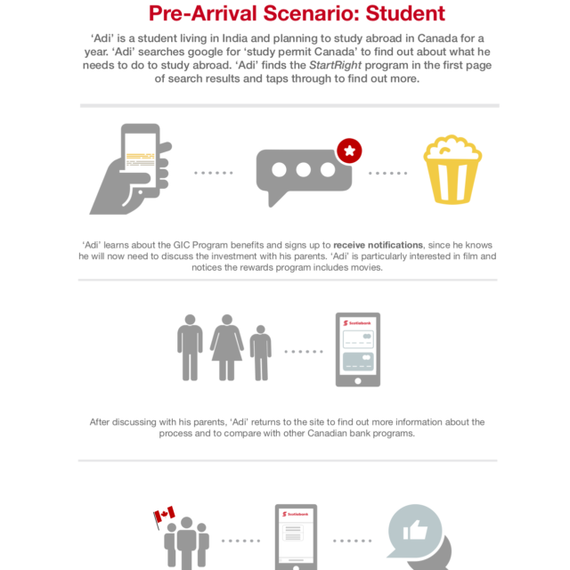
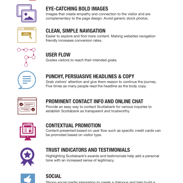
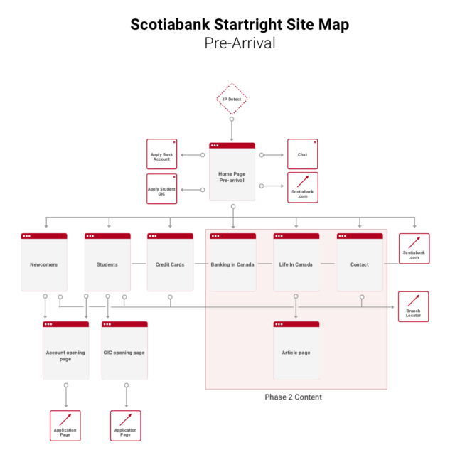
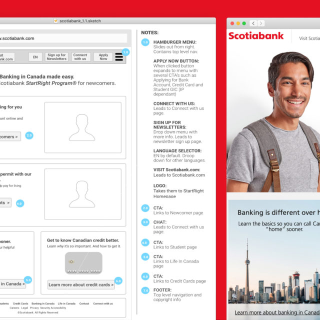
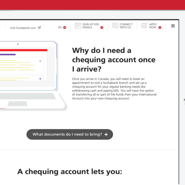
Scotiabank previous website for newcomer was a collection of 120 pages with 4 levels of deep navigation and no clear user journey. By looking closely as analytics and user habits a streamlined user flow was developed to get the newcomer or student to their intended goal. Page count was reduced to only 16 pages and still provided all important banking information needed for them to open a Canadian account with ScotiaBank or get their student GIC. The “mobile first” experience was optimized to work exceptionally well on the typical low end mobile devices indicative to the target demographic. The brutalist Art Direction was utilized to speed up both the page load and to simplify the user experience.


